Voice AI Agents
Never Fail To Engage Another Caller Again

Never miss a customer call
Answer calls without picking up the phone. AI Voice Agents engage callers immediately while sounding nearly human. They can easily keep up in the conversation while always sounding confident.
Your new virtual receptionist
Receptionist answers calls when you're out of office, closed or just busy on the phone. All missed calls are transcribed and delivered to you in our CRM's Unified Inbox or emailed to you and as many other team members that you specify.

Dark Mode Your Admin Area
You can define your own colors or just use our default ones.
Quick & Easy! Copy & Paste the CSS code into Stylus CSS Injector Browser Plugin Firefox, Chrome.
I usually use the Dark Reader Browser Plugin to darken web pages but it causes some pages to freeze
in this admin area. So, I wrote my own dark mode theme using the Stylus CSS Injector Browser Plugin.
Important! In the Stylus extension, the "as Usercss" checkbox is located on the main Manage page. To create and save a style without metadata, you must make sure this box is unchecked before you click the "Write new style" button. How to save a style without metadata Click the Stylus icon on your browser's toolbar and select the Manage option. On the left side of the Manage page, look for the Write new style button. Directly next to that button, ensure the "as Usercss" checkbox is unchecked. Click the Write new style button. The editor that opens will now be in the "Mozilla Format," which does not use the UserCSS metadata. Write or paste your CSS code into the editor, give it a name, and save it.
:root {
/* Define New Styles */
/* Last Updated 10/14/2025 */
  --text-color-1: #FFF;
  --text-color-2: #0DD;
  --bg-color-1: #011;
  --bg-color-2: #022;
  --bg-color-3: #033;
  --bg-color-hover: #300;
  --border-color-1: #FFF;
  --border-color-2: #0DD;
  --button-bg-color-1: #301;
  --button-bg-color-1-hover: #603;
  --button-bg-color-2: #033;
  --button-bg-color-2-hover: #044;
  --button-bg-color-disabled: #111;
  --button-border-color-1: #0DD;
  --button-border-color-2: #0DD;
  --button-border-color-disabled: #BBB;
  --button-text-color-1: #FFF;
  --button-text-color-2: #FFF;
  --button-text-color-disabled: #BBB;
  --switch-bg-color: #301;
  --switch-border-color: #0DD;
  --switch-button-color-on: #0DD;
  --switch-button-color-off: #088;
  --select-option-bg-color: #033;
  --select-option-bg-color-hover: #044;
  --select-option-bg-color-selected: #066;
  --input-border-color: #0DD;
  --input-text-color: #0FF;
  --input-bg-color: #011;
  --alert-bg-color: #F80;
  --warn-bg-color: #FF0;
  --load-bg-color: #011;
}
:root {
/* Overrite Existing Styles */
  --base-white: #022 !important;
  --base-black: #FFF !important;
  --primary-25: #033 !important;
  --primary-50: #033 !important;
  --primary-100: #033 !important;
  --primary-200: #033 !important;
  --primary-300: #033 !important;
  --primary-400: #033 !important;
  --primary-500: #033 !important;
  --primary-600: #033 !important;
  --primary-700: #033 !important;
  --primary-800: #033 !important;
  --primary-900: #033 !important;
  --success-25: #033 !important;
  --success-50: #033 !important;
  --success-100: #033 !important;
  --success-200: #0DD !important;
  --success-300: #0DD !important;
  --success-400: #0DD !important;
  --success-500: #0DD !important;
  --success-600: #0DD !important;
  --success-700: #0DD !important;
  --success-800: #0DD !important;
  --success-900: #0DD !important;
  --warning-25: #033 !important;
  --warning-50: #033 !important;
  --warning-100: #fef0c7 !important;
  --warning-200: #fedf89 !important;
  --warning-300: #fec84b !important;
  --warning-400: #fdb022 !important;
  --warning-500: #f79009 !important;
  --warning-600: #dc6803 !important;
  --warning-700: #b54708 !important;
  --warning-800: #93370d !important;
  --warning-900: #7a2e0e !important;
  --error-25: #033 !important;
  --error-50: #033 !important;
  --error-100: #033 !important;
  --error-200: #033 !important;
  --error-300: #fda29b !important;
  --error-400: #fa7066 !important;
  --error-500: #f04438 !important;
  --error-600: #d92d20 !important;
  --error-700: #b42318 !important;
  --error-800: #912018 !important;
  --error-900: #7a271a !important;
  --gray-25: #033 !important;
  --gray-50: #033 !important;
  --gray-100: #033 !important;
  --gray-200: #033 !important;
  --gray-300: #0DD !important;
  --gray-400: #0DD !important;
  --gray-500: #0DD !important;
  --gray-600: #0DD !important;
  --gray-700: #0DD !important;
  --gray-800: #0DD !important;
  --gray-900: #0DD !important;
  --box-shadow: 0 0 0 2px rgba(21, 94, 239, .2) !important;
  --shadow-md: 0px 1px 3px rgba(16, 24, 40, .1), 0px 1px 2px rgba(16, 24, 40, .06) !important;
  --shadow-lg: 0px 12px 16px -4px rgba(16, 24, 40, .08), 0px 4px 6px -2px rgba(16, 24, 40, .03) !important;
  --base-black-rgba-opacity: rgba(0, 221, 221, .5) !important; /* #0DD Converted To RGB */

  --bg-gray-25: transparent !important; /* Didn't Seem To Work */
  --n-color: rgba(255, 255, 255, 0) !important;
  --white: #022 !important;
}

/* Notes: */
/* :not([data-v-37d723fd]) is a selector for a div attribute on the Brand Boards page which prevents losing the bg colors */
/* :not(.ghl-color-preview) is a selector for a div class on the Brand Boards page which prevents losing the thumbnail bg colors */
/* Adding the above not() selectors to the ( .hl-wrapper-container * ) helps fix Brand Boards thumbnail problem but breaks the Worfflow Editor BG which doesn't make sense to me because ( data-v-37d723fd ) and ( ghl-color-preview ) don't exist in the page html searched in the browsers inspector */
/* Adding the above not() selectors to the ( .max-w-full * ) and ( .max-w-full * ) breaks the BG colors of the Draft/Publish switch on the Workflow Editor. However, turns out just disabling these lines doesn't break the look of the right side settings panel which I think is why I made these in the first place. Could probably just delete these lines */

/* Workflow List */
/* .hl-wrapper-container *:not(.ghl-color-preview):not([data-v-37d723fd]) { background-color: transparent !important; } */
.hl-wrapper-container * { background-color: transparent !important; }
.hl-wrapper-container,
.hl-wrapper-container * footer { background-color: var(--bg-color-1) !important; }
.min-h-screen { background-color: transparent !important; }
#workflow-list-header-btn-secondary,
#btn-list, #btn-recent, #btn-copy-workflow-logs { background-color: transparent !important; }

.n-tag--round { background-color: transparent !important; }

.n-tag.n-tag--round.hl-success.capitalize { background-color: var(--bg-color-2) !important; }

/* Workflow Editor */
/* #app *:not(.ghl-color-preview):not([data-v-37d723fd]) { color: var(--text-color-1) !important; } */
#app * { color: var(--text-color-1) !important; }

#app { background-color: transparent !important; }

.hl-wrapper-container.full-screen { background-color: transparent !important; }

.n-tabs-tab { color: var(--text-color-1) !important; }
.n-tabs-tab--active * { color: var(--text-color-2) !important; }
.n-tabs-tab--active { border-bottom: 3px solid var(--border-color-2) !important; }

.vue-flow__pane, .vue-flow__viewport, .vue-flow__container { background-color: var(--bg-color-1) !important; }
/* .vue-flow__node { background-color: #033 !important; } */

.bg-white { background-color: #033 !important; }

.bg-blue-50 { background-color: transparent !important; }

/* max-w-full is a wider sized panel in comparison to w-full */
/* .max-w-full *:not(.ghl-color-preview):not([data-v-37d723fd]), */
/* .w-full *:not(.ghl-color-preview):not([data-v-37d723fd]) { background-color: transparent !important; }  */
.max-w-full * .n-button, .w-full * .n-button { background-color: var(--button-bg-color-1) !important; }
.n-button, .n-button--default-type, .n-button--small-type, .n-button--medium-type, .quaternary, .px-1 { background-color: var(--button-bg-color-1) !important; }
#dd { background-color: var(--button-bg-color-1) !important; }
.n-button-group, .n-button-group--vertical { background-color: var(--button-bg-color-1) !important; }
#pg-email-ai__btn--build-ai { background-color: var(--button-bg-color-1) !important; }

#workflow-zoom-in, #workflow-zoom-value, #workflow-zoom-out, #workflow-fit-to-screen { background-color: var(--button-bg-color-1) !important; }

.add-new-trigger { border-color: var(--border-color-1) !important; }

.node-comment { background-color: var(--button-bg-color-1) !important; }

.mr-2, .p-2, .rounded-md, .bg-green-50 { background-color: transparent !important; }

.ml-4.py-4.px-2 { background-color: var(--button-bg-color-1) !important; border: 2px solid var(--button-border-color-1) !important; }

#cancel-button-aside-section,
#pg-actions__btn--delete-action-trigger,
#pg-actions__btn--delete-action-email,
#add-cc-email, #add-bcc-email,
#pg-email-ai__btn--build-ai,
#send-test-email, #add-email-attachment { background-color: var(--button-bg-color-1) !important; }
#add-email-attachment * { color: var(--text-color-1) !important; }

.n-button__border, .n-button__state-border { border-color: var(--button-border-color-1) !important; }

.bg-red-400 { background-color: var(--alert-bg-color) !important; }
.bg-red-500 { background-color: var(--alert-bg-colorZZZZZZZZ) !important; } /* Save Button Alert Dot Looks Much Better With This Disabled By Using Wrong Var Name */

.vue-flow__panel { background-color: transparent !important; }

.max-w-full .n-input,
.max-w-full * input,
.n-input-wrapper { background-color: var(--input-bg-color) !important; }

.n-base-selection-label { background-color: var(--input-bg-color) !important; }
.ui-wrapper-mulit-select { background-color: var(--input-bg-color) !important; }
.n-base-selection__state-border { border: 1px solid var(--input-border-color) !important; }

.editor-container.text-black.ghl-workflow-text-editor { background-color: var(--input-bg-color) !important; }

.cm-content { background-color: #011 !important; } /* Workflow Editor - Custom Code Action - Javascript Code Editor */

.ghl-code-mirror { background-color: #000 !important; }
.cm-editor { height: 888px !important; }

/* Documents & Contracts - Editor */

div[data-v-098f90c8=""] { background-color: var(--bg-color-1) !important; }

.pages-wrapper { background-color: var(--bg-color-1) !important; }


select {
    display: block;
    border: 1px solid #00DDDD;
    border-radius: 4px;
    color: #00DDDD;
    font-family: Arial, sans-serif;
    background: transparent;
    padding: 8px 30px 8px 8px; /* Added padding on the right for the arrow */
    outline: none;
    cursor: pointer;
    position: relative; /* Required for the pseudo-element */
}
select::after {
    content: '▼'; /* Unicode for a downward arrow, you can use other symbols or an image */
    position: absolute;
    right: 10px;
    top: 50%;
    transform: translateY(-50%);
    color: #00DDDD;
    pointer-events: none; /* Ensures the arrow doesn't interfere with clicks */
}
select option {
    color: #00DDDD;
    background: transparent;
    background-color: #002222;
    border: 1px solid #00DDDD;
}
select option:focus {
    color: var(--text-color-1)FFF;
    background-color: #004444;
}
.custom-input {
    border: 1px solid #00DDDD;
    border-radius: 4px;
    color: #00DDDD;
    font-family: Arial, sans-serif;
    background: transparent;
    padding: 8px;
}

body { background-color: var(--bg-color-2) !important; }
.hl_v2-location_switcher { background-color: var(--bg-color-2) !important; border: 2px solid #0DD !important; } /* Account Switcher Menu */
.hl_v2-location_switcher input { background-color: var(--bg-color-2) !important; border: 1px solid #0DD !important; }  /* Account Switcher Menu */

/* Billing Page */
#location-billing { background: none !important }
.hl-card .n-base-selection-label { background-color: var(--input-bg-color) !important; }
.status-type-select { background-color: transparent !important; }

/* Sub-Account Switcher Page... */
#locations-list { background: none !important; }
.sticky { background-color: var(--bg-color-2) !important; }
#locations-account-details { background: none !important; } /* Sub-Account Details */
.text-md { color: var(--text-color-1) !important; }
.n-form-item-label__text { color: var(--text-color-1) !important; }
.hl-card * input { color: var(--text-color-1) !important; background-color: var(--input-bg-color) !important; }
.n-input { background-color: rgba(0, 0, 0, 0) !important; border: 1px solid var(--input-border-color) !important; } /* Make Background Color Transparent */

.main-table * { color: var(--text-color-1) !important; }
.hl_form-builder--main { background-color: var(--bg-color-2) !important; }

/* Settings Colors... */
.hl_settings { background-color: var(--bg-color-2) !important; } /* Settings Page BG Color */

.hl-text-lg-semibold, .hl-text-sm-medium, .hl-text-sm-regular { color: var(--text-color-1) !important; }

.hl-display-sm-medium { color: var(--text-color-1) !important; } /* Titles Text Color */
.hl-text-md-normal { color: var(--text-color-1) !important; } /* Sub-Titles Text Color */
/* .items-center { color: #0DD !important; } */ /* Top Menu Text Color - Changing this color caused problems on the D&C Template Builder */
.origin-top-right { background-color: var(--bg-color-2) !important; border: 1px solid var(--button-border-color-1); } /* Top Sub-Menu Text Color */
.opportunityPage { background: none !important; } /* Opportunities Page BG Color */
/* .grid { background-color: var(--bg-color-2) !important; } Opportunities Grid BG Color */
/* Contacts List Colors... */
.table { background-color: var(--bg-color-2) !important; } /* Contacts Table BG Color */
.table * { color: var(--text-color-1) !important; } /* Contacts Table Text Color All Decendants */
.flex-page-bar { background-color: var(--bg-color-2) !important; } /* Contacts Table BG Color */
.barsection * { color: var(--text-color-1) !important; } /* Contacts Table Text Color All Decendants */
.dropdown-menu { background-color: var(--bg-color-2) !important; border: 1px solid var(--input-border-color) !important; } /* Contacts Hidden Menu BG Color */
/* Contacts Details Colors... */
.hl_contact-details-left, .bg-white { background-color: var(--bg-color-2) !important; } /* Contacts Table BG Color */
.hl_contact-details-left input { color: var(--text-color-1) !important; background-color: var(--bg-color-2) !important; border: 1px solid var(--input-border-color) !important; } /* Contacts Input BG Color */
.hl_contact-details-left * .label { color: var(--text-color-1) !important; } /* Contacts Input BG Color */
.hl_contact-details-left textarea { color: var(--text-color-1) !important; background-color: var(--bg-color-2) !important; border: 1px solid var(--input-border-color) !important; field-sizing: content !important; } /* Contacts Input BG Color */
.hl_contact-details-left .v-select { background-color: var(--input-bg-color) !important; border: 1px solid var(--input-border-color) !important; } /* Contacts Input BG Color */
.hl_contact-details-left .vs__selected { background-color: var(--select-option-bg-color) !important; border: 1px solid var(--input-border-color) !important; } /* Contacts Input BG Color */
.hl_contact-details-left .vs__search { background-color: transparent !important; border: 0px solid var(--input-border-color) !important; } /* Contacts Input BG Color */
.hl-text-input { background-color: var(--input-bg-color) !important; }
.hl_contact-details-left .dropdown-item:hover { background-color: var(--select-option-bg-color-hover) !important; }
.hl_contact-details-left .dropdown-item.selected { background-color: var(--select-option-bg-color-selected) !important; }
.n-button { color: var(--text-color-1) !important; background-color: var(--button-bg-color-1) !important; border: 1px solid var(--button-border-color-1) !important; }

.n-button * { color: var(--text-color-1) !important; }
.btn.btn-light { background-color: var(--button-bg-color-1) !important; }
/* Contacts List Button Colors */
.hl_smartlists--controls .hl_controls--left .btn { background-color: var(--button-bg-color-1) !important; }
.hl_smartlists--controls .hl_controls--left .btn:hover { background-color: var(--button-bg-color-1-hover) !important; }
.hl_smartlists--controls .hl_controls--left .btn:disabled { background-color: var(--button-bg-color-1-disabled) !important; }
.hl_smartlists--controls .hl_controls--left .btn svg { color: var(--button-text-color-1) !important; }
.hl_smartlists--controls .hl_controls--left .btn:disabled svg { color: var(--button-text-color-1) !important; }
.hl_smartlists--controls .hl_controls--left .btn svg path { fill: var(--button-text-color-1) !important; }
.hl_smartlists--controls .hl_controls--left .btn:disabled svg path { fill: var(--button-text-color-1) !important; }
.hl_smartlists--controls .hl_controls--left .btn i { filter: brightness(2.5) !important; } /* filter needed for lightening the i icon */
.hl_smartlists--controls .hl_controls--left .btn:disabled i { filter: brightness(2.5) !important; } /* filter needed for lightening the i icon */

/* Contacts Dialoge Modal Pop-Up Colors... */
.hl_conversations--message * { background-color: var(--bg-color-2) !important; color: var(--text-color-1) !important; }
.hl_conversations--message .editor-wrapper { border: 1px solid var(--border-color-2) !important; }
.hl_conversations--message #subject,
.hl_conversations--message .n-base-selection-tags { border: 1px solid var(--border-color-2) !important; }
.hl_conversations--message * .n-button__state-border { background-color: #033 !important; color: var(--text-color-1) !important; }
.hl_conversations--message * span,
.hl_conversations--message * svg { background-color: transparent !important; color: var(--text-color-1) !important; }
.hl_conversations--message .n-base-wave,
.hl_conversations--message .n-button__border,
.hl_conversations--message .n-button__state-border { display: none !important; }
.n-date-panel { background-color: #033 !important; color: var(--text-color-1) !important; border: 1px solid var(--border-color-2) !important; border-radius: 6px; }
.n-base-selection-label { background-color: var(--input-bg-color) !important; }
.bg-gray-50 { background-color: #044 !important; }

/* Contacts Date Dialoge Panel */
.n-modal { background-color: #033 !important; border: 1px solid var(--border-color-2) !important; }
.n-modal * { color: var(--text-color-1) !important; }
.n-modal * button {  color: var(--text-color-1) !important; background-color: var(--bg-color-2) !important; border: 1px solid var(--border-color-2) !important; }

.hl_conversations--message textarea { background-color: var(--bg-color-2) !important; border: 1px solid var(--bg-color-2); border-radius: 6px; color: var(--text-color-1); } /* Contacts Input BG Color */
.hl_contact-details-right * { background-color: transparent !important; color: var(--text-color-1) !important; }
.hl_contact-details-right, .activity-pane-content { background-color: var(--bg-color-2) !important; }
.hl_contact-details-right svg { color: var(--text-color-1); }
.hl_contact-details-right svg { color: var(--text-color-1); }
.nav-link.active { color: #0DD !important; border-color: var(--border-color-2) !important; }
.nav-link.active * svg { color: #0DD !important; }
button * svg { color: var(--text-color-1); }
.n-card div .rounded-full { background-color: #033 !important; border: 1px solid var(--border-color-2) !important;  }
/* .items-center * { color: var(--text-color-1) !important; } */
/* Select Boxes */
.form-group .bootstrap-select .dropdown-toggle.btn-light { background: none !important; }
.btn.dropdown-toggle { background: none !important; }
.btn.btn-light { background: none !important; border: 1px solid var(--border-color-2) !important; }
.btn.btn-light:focus, .btn.btn-light:hover { background: none !important; }
.bootstrap-select > .btn.dropdown-toggle:focus, .bootstrap-select > .btn.dropdown-toggle:hover { background: none !important; }
.bootstrap-select * { color: var(--text-color-1) !important; }
.dropdown * { color: var(--text-color-1) !important; }

.border-gray-300 { border: 1px solid var(--border-color-2) !important; }

/* Calendar Page */
.bg-gray-25 { background-color: transparent !important; }

/* Voice AI Agents Page */
/* .hl-card *:not(.ghl-color-preview):not([data-v-37d723fd]) { background-color: transparent !important; color: var(--text-color-1) !important; border-color: var(--border-color-2) !important; } */
.hl-card * { background-color: transparent !important; color: var(--text-color-1) !important; border-color: var(--border-color-2) !important; }
.hl-card { background-color: var(--bg-color-2) !important; border: 1px solid var(--border-color-2) !important; }
.tab-content * button { background-color: transparent !important; }
.n-input-wrapper { background-color: var(--input-bg-color) !important; }

/* Voice AI Agents Page - Test Your Agent */
.card * { background-color: transparent !important; }
.card { background-color: var(--bg-color-2) !important; border: 1px solid var(--border-color-2) !important; }

.table-container { background-color: var(--bg-color-2) !important; }

.hl_wrapper,
.hl-wrapper-container,
.hl-wrapper-container * footer { background-color: var(--bg-color-1) !important; }
.hl_header {
 background-color:var(--bg-color-2) !important;
}

/* Changing INPUT Settings Towards The End Here After The More Global * WildCard * BG Settings Already Happened */
.n-switch .n-switch__button { background-color: var(--switch-button-color-off) !important; height: 14px !important; }
.n-switch--active .n-switch__button { background-color: var(--switch-button-color-on) !important; height: 14px !important; }
.n-switch__rail { background-color: var(--switch-bg-color) !important; border: 2px solid var(--switch-border-color) !important; height: 22px !important; }

/* !!! FIXES THE BLINDING WHITE BACKGROUND SHOWN WHEN LOADING EVERY SINGLE FREAKING PAGE !!! */
.hl-loader-container {
    background-color: var(--load-bg-color) !important; /* Dark color to reduce brightness */
}
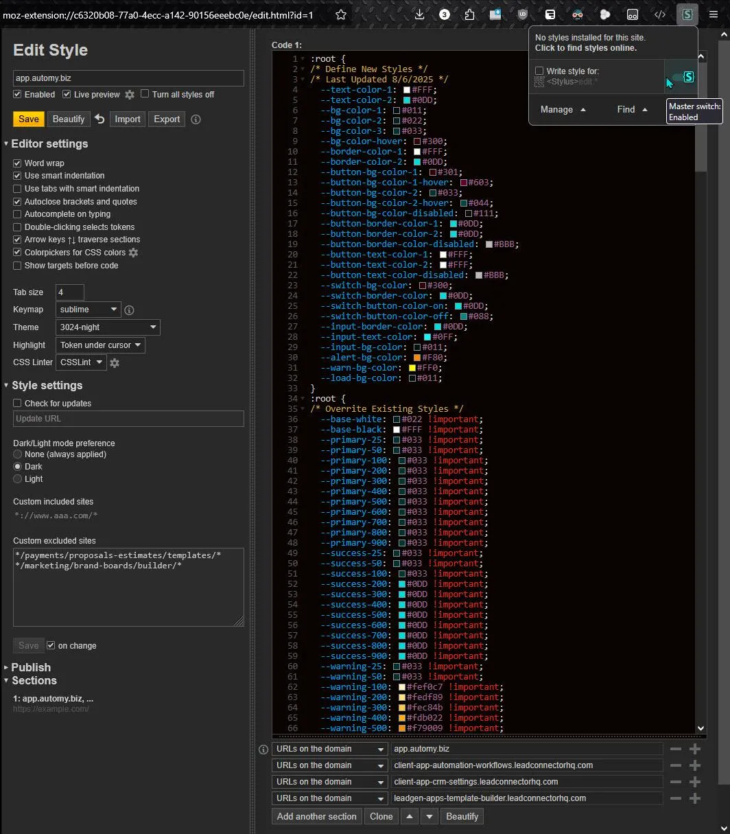
Also, be sure to add the following domains to the white list of the Stylus CSS Editor page...
Also, be sure to add the following page URL segments to the Custom Excluded Sites field
in order to prevent Stylus from running on pages that it's having problems with.
Feel free to add to this list as not all pages have been tested...
Note: You might have to refresh the page in order for Stylus to take effect!
Here's a screenshot to show how I have Stylus set up on my Firefox browser...
Please Note: This CSS code above will darken almost everything in the admin area.
But it won't darken everything. It's not finished yet. It's a huge amount of work to do this!
Just to get the code this far has taken about 1 week cumulatively over the course of several months.
So, if something isn't being darkened for you. Try copying and pasting the above code again into Stylus.
This will ensure you're getting the most current version. If something still isn't being darkened, tell us!
Email Brian a screenshot or short video: [email protected]
Here's a placeholder video to intro you to Stylus until I make a better one...
Know Who Called You
Always be in the know
See every caller’s conversation history before responding.